Developing a niche rock climbing app.
Helping fellow rock climbing to quickly record their climbing sessions for easier tracking and learning of their abilities.
The why
This was a personal project that I designed and developed myself with the help of my wife - who is always brutally honest about her opinions and has a very good eye for detail.
The process
Taking what I have learnt over the years and applied to a new product, which in simple terms followed the following steps.

The inspiration
I am an avid climber who is always looking to improve and understand what I can do better. This was a personal problem that I had of keeping track of what I was climbing in each session and compare these results to other sessions. So essentially I needed a logbook but I never would be bothered to carry a book around, so an app was the next best thing.
Researching the niche
I was fortunate enough to have an understanding of climbing but as it is a specialised and niche area there very different ways of working and standards that are used for each style which required myself to learn a lot about other areas.

Market
I performed a high level market analysis and saw that there were several climbing apps or websites that do similar capabilities but nothing focused on longer term tracking and analysis.
The following apps were deemed as competitors:
* MyClimb is probably the closest competitor to the concept but it is more focused on the social aspects and sharing your best climbs. It is not intended for capturing all your session or climbing information. They also have a focus on the climbing gym and helping them to promote their centre.
* Vertical Life is a very popular and well published app that is based by famous climbers, such as Chris Sharma. It has more of a focus on goals and promotion of centres within Europe.
* Rockfax is popular outdoor climbing guide series focusing on topographies and route information, they have since then introduced an app focusing on getting users / climbers to pay a monthly subscription instead of purchasing a once off book. It has some logging abilities, namely by teaming up with UKClimbing Logbook (see below) to allow climbers to capture which routes they have completed.
* UKClimbing is very popular online climbing resource with many good articles and of course, their famous and extensive global outdoor crag list. Climbers can make which crags they have completed. It is focused on individual routes and does not capture sessions or any other details about a climbing session.
There are many more resources, websites and apps that were applicable but I appreciate you may not want to read all that.
Users
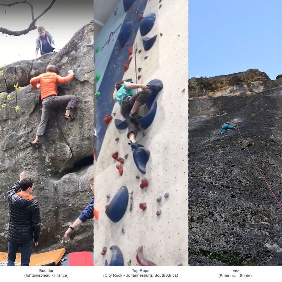
There are many types of users or climbers as their styles or disciplines of climbing from 'Trad' or traditional, bouldering, lead, top roping, alpinism, etc... On top of this there are different grading systems used across the global and these even vary at times between indoors and outdoors. So, in summary there are very few standards between each disciplines or style. Therefore, I decided to focus on the few disciplines that I was most familiar which were: Bouldering, Top Roping and Lead. These disciplines can be applied for both indoor and outdoor events.
Selecting a subset of user types helped to identify users to interview and receive their inputs. As I am already an avid climber this was fairly easy as I had simply got to the areas that I regularly frequented and ask others on their thoughts. This was initially done with a informal conversational interview to help get the broader requirements but later I started using some visual aids to help show some early concepts to users for the opinions. All these were fed back into the research process and led to the first set of prototypes.
During this interviewing process I was also engaging what devices the users were using, which was roughly evenly split between iPhone and Android devices. Although this was an area that I was always conscience is difficult to get right due to the audience size that I was speaking to. It was assumed initially that both platforms would need to be catered for.
Prototyping
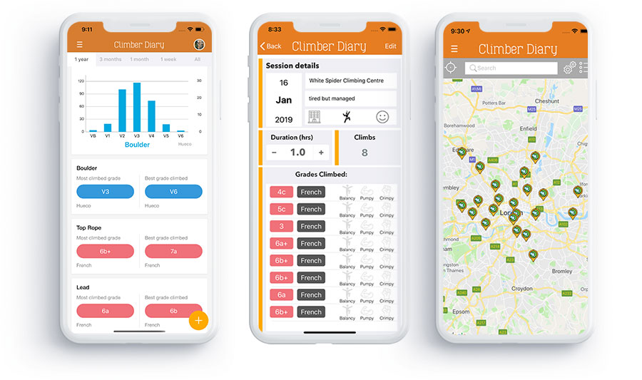
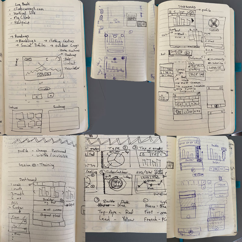
The key to the app was to create some engaging but most importantly easy and fast. I wanted to create something simple and explored ideas that didn't rely on much User Interface, instead the focus was on functionality and capturing data easily and rapidly. After drawing up some ideas, I started prototyping to see how they felt. At this point I didn't have the app thought out but I was still exploring and looking to get other opinions.

Proposition
After exploring a few options, I had a paper and Photoshop prototype that I thought was good enough to get some user testing on. The goal of the prototype was to demonstrate two main themes which were easy climbing capture and showing this data in a useful way. There were additional items that needed to be further refined but I believe that I should invest most of my effort on these core capabilities.
Design
The user interaction was the primary concern of the app but as the app was focused on climbing which is often used as an escape for many people, the theme of the app was to promote natural scenery and surroundings. Additionally, there were several terminology and groups that I needed to define such as grouping each climb into a 'session' which will contain the key bits of information such as location, duration, etc...
The technical solution was also something that was considered in the design, I wanted to include a modular solution that could be updated and adjusted easily. This was mainly done through the use of APIs serving as the main 'pipe' of data. Most data analysis will be done on the app itself where data is not sensitive (e.g. login details). This also meant that all data would be present online and synchronised when needed. This also was an assumed benefit of having the data present online allowing the user to use any channel or not worry about losing their data.
User Testing
Engaging with other climbers was very useful as their opinions and thought process was very different to what I had imagined and they definitely helped shape what useful for them. I also found out as there were so many standards for climbing grades that the app will need some form of grade calculator to ensure that climbers can make sense of the app on an international scale, which led to myself to establish a Grade Calculator capability will be needed for day 1.
Incorporating feedback
As mentioned, much of the comments and feedback was incorporated through face to face meetings with other climbers which helped in understanding the core steps or tasks needed to capture a session. It also helped to ensure that only the bare minimum amount of information is captured and that presets should be used as much as possible. There were additional data items too that were identified such as capturing the feeling of session or describing a particular climb as 'pumpey', etc...
Testing the revised prototype
Once the screens were updated and shared with fellow climbers these were again reiterated a couple times before a working minimum viable product was shared. This acted as a beta phase and posed as testing phase to determine user's performance and feedback. This ran for several weeks with continuous updates being applied.
Planning the rollout
Before actually releasing anything to a wider audience, I thought a lot on the architecture and technical aspects of the app including the APIs. I was concerned that if there was a lot of changes going it would be hard to keep the same set of APIs that can be used across different versions of the apps and platforms. Essentially I wanted to keep it simple and flexible (and secure of course). So the solution I came up with was as simple version control of APIs (e.g. an app version could use v1.0, v1.1, etc..) so these could be kept to even support older app versions if needed. So far this seems to be worked as it is pretty easy to introduce new features in a new app release when required.
The next question was whether to go for iOS or Android first, I had a hypothesis which was validated through the research, that the target market would be mostly Android users. Therefore, the first release would be for iOS devices. The stricter guidelines for App Store submission provided to be a helpful starter too as it forced myself to provide a lot of the content required (e.g. screenshots, copy, etc..) and test data that is required by the reviers. The initial few users were onboarded without much instructions which was intentional to see how they managed to proceed. They were shared the app through TestFlight.
Going live
Going live was a continual and phased approach which consisted of releasing the apps across iOS and Android at different phases. Any key issues or insights that needed changes were incorporated into the other platform as soon as possible. This meant that there was a common set of requirements as well as a platform set.
The non public facing launch was called the Alpha phase and was performed through TestFlight and sharing the Android APK file directly (usually via Whatsapp). The Beta phase was the first customer facing phase which started with iOS quickly followed by Android. This was to help ensure that the back-end was working and that no blocking issues would impact the launch. Over the course of several weeks there were additional releases introduced with additional features, these were mainly requested by public launch users.
Monitoring results
Despite the app appealing to a small niche market - Climber Diary has over 300 active users with over 12,000 climbs having been recorded. I currently has an average rating of 4.0. Despite my initial hypothesis it turns out there are more iOS users who are also more active than Android users. It goes to show that even after testing this hypothesis you can be surprised :)
Current status
Climber Diary is still on the Apple App Store with continuous improvements and features being released.
